
USPTO Internal Portal UX Design.
A unified self-service experience designed to make enterprise data, internal tools and access requests easier to find and navigate.
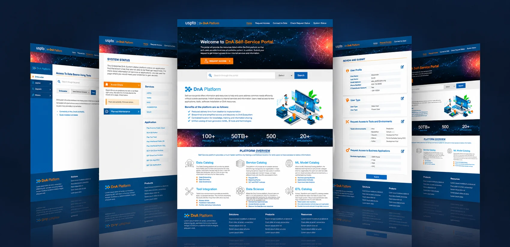
A single destination for data and services.
The USPTO DnA Self-Service Portal brings together information and resources that help internal users access data-related services, applications and tools. Its centralized approach supports common tasks—from finding relevant resources and connecting to data to requesting access and checking service availability.
The design direction prioritizes clear navigation, consistent page structures and an approachable interface for complex enterprise workflows.
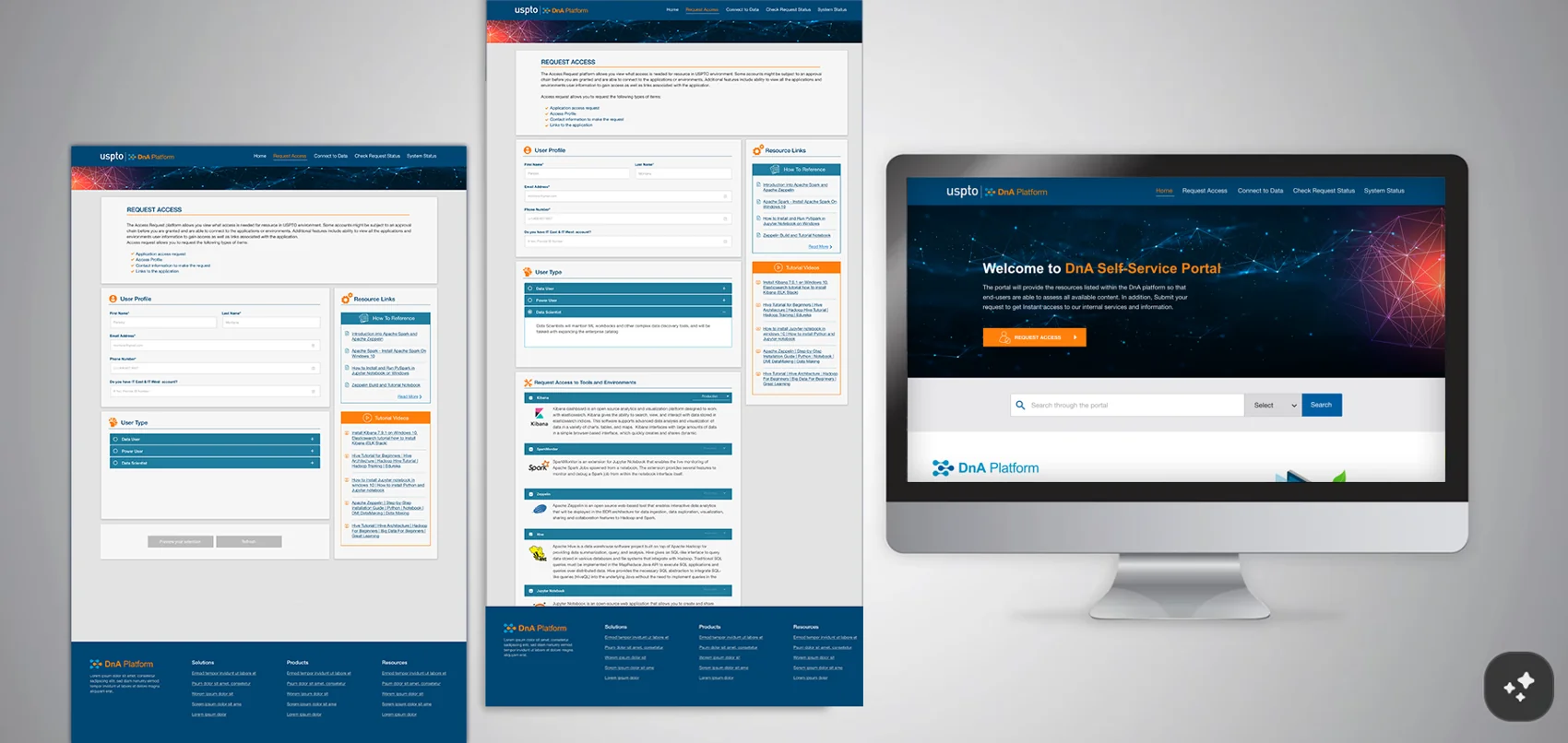
Make complex resources easier to discover.
Users working across data platforms may need to locate datasets, understand available tools, follow service instructions and determine the status of their requests. The interface organizes these distinct needs around recognizable tasks, with search, navigation and action-oriented pathways.
Prominent calls to action, scannable content blocks and consistent visual patterns help reduce the effort required to find the next step.
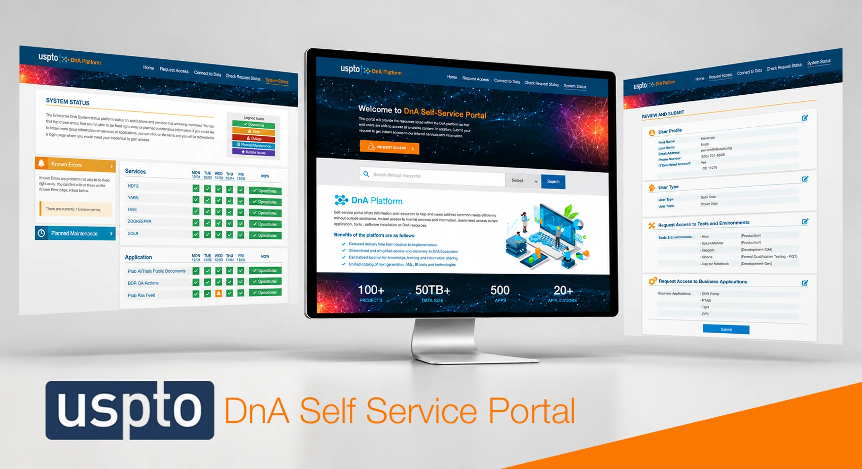
Support discovery, access and status in one flow.
The portal homepage introduces the platform and highlights six resource areas: Data Catalog, Service Catalog, ML Model Catalog, Tool Integration, Data Science and ETL Catalog. Each provides a clear starting point for discovering information or accessing specialized capabilities.
Supporting interfaces include data-source access tools, system-status dashboards and a structured request-and-review workflow. Together, these patterns create a consistent self-service experience across the portal.
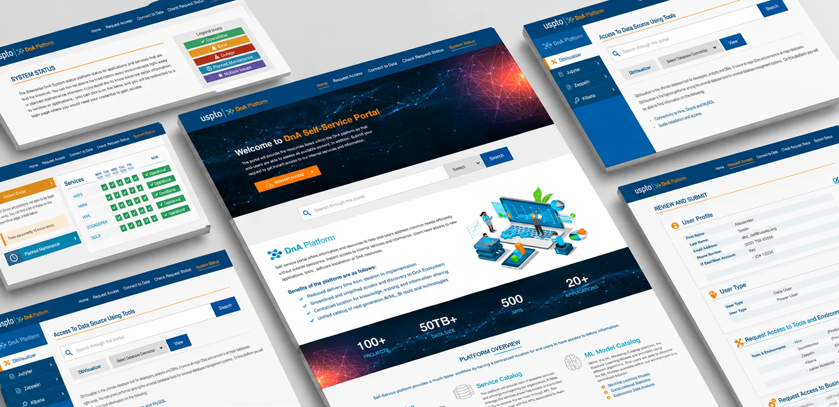
A recognizable, task-focused system.
A navy and blue foundation, orange action accents and bright content surfaces establish visual hierarchy while aligning the portal with its institutional setting. Reusable cards, search fields, tables, status indicators and request forms make dense technical information easier to scan.
The result is a cohesive UI concept that communicates the platform’s purpose while giving users clear paths toward the information and tools they need.
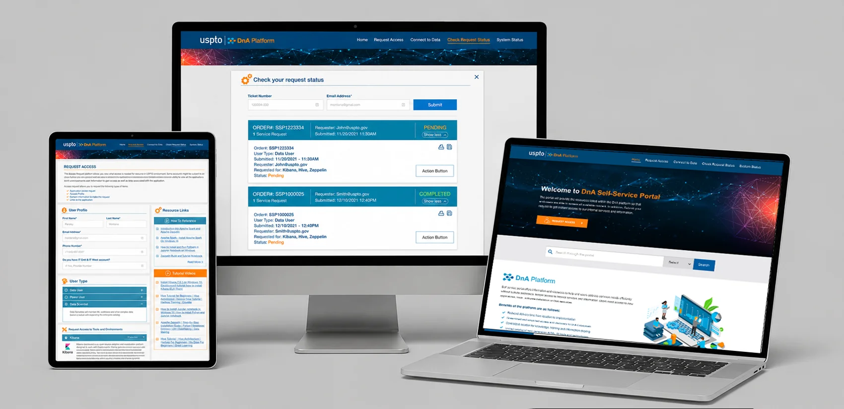
A clearer path to internal resources.
The proposed experience consolidates portal navigation and self-service entry points into a coherent interface. It demonstrates how a structured information architecture and consistent visual language can support data discovery, access requests and system awareness.
This case study presents the supplied design work; operational metrics shown in the interface are part of the artwork and are not presented as measured outcomes.